
Let's continue on explaining a little bit about "color"
This is what I use for designing: the color wheel.
I know some of you will say: "how do I use this color wheel?"
It's not that hard so let's start with basics by showing your the color wheel:

Here is an explanation of the color wheel I got from this website:
The COLOR WHEEL has 12 segments that consist of
primary, secondary and tertiary hues, or colors.
The three PRIMARY colors are RED, YELLOW, and
BLUE. They form a triangle on the wheel. These colors cannot be mixed by
combining any other colors. They are indicated on the color wheel with a P.
The three SECONDARY colors of ORANGE, VIOLET, and
GREEN (marked on the chart by an S)
are created by mixing equal parts of the primary colors they fall in between;
ie, VIOLET is the secondary color produced by mixing equal parts of RED and
BLUE.
The TERIARY colors are the colors that result
from mixing the primary and secondary colors on either side of them: ie, mixing
the secondary color ORANGE with the primary color RED results in red-orange.
These colors are marked on the color wheel with a T.
Using the color wheel you can determine color schemes fpr balance
and harmony in your artwork, webpages, desktop publishing designs or home
decorating.
Hue: Hue refers to the color...red, blue, etc.
The primary, secondary, and tertiary colors, or
hues, are these colors at their full saturation or brightness; that is, there,
there is no white, gray, or black added.
Value: the lightness or darkness of a color, or
the relative amount (percentage) of white or black in a hue.
Luminosity, or Lightness: A measure of the amount
of light reflected from a hue. Those hues with a high content of white have a
higher luminance, or value.
Tints: white when added in increments to any
color results in a lighter value of that color, called a tint.
Blue and white make light blue, which is a tint of Blue.
Shades: black or gray when added in increments to
any color results in a darker value of that color, called a
shade. Blue and Black make dark blue, a shade of blue.
Saturation: The degree of purity of a hue.
Intensity: The brightness or dullness of a hue.
Iintensity maybe lowered by adding white or black.
* * * * * * * *

Colors opposite of each other on the color wheel are COMPLEMENTARY colors, this means they work very well together (complement each other/balance).
Like red and green, blue and orange etc...
This is just a brief explanation about color and we can incooperate this into our "designs".
For example:


Red and green
I am trying to show you that this is just a tool to help you in designing...
You can also decide to use the rainbow colors, like my blog header of my own hand dyed yarns:

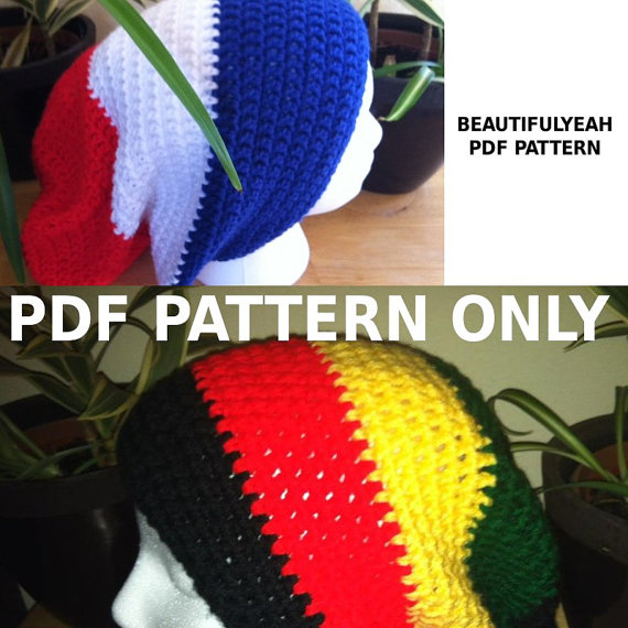
Or like I used the "rasta" colors in my design below:
There are so many ways that I won't be able to cover them all but know that working with the color wheel rules you design will look "balanced" and is "easy" on the eyes...
Be free, it's art so let those creative juices flow...
Have fun and feel free to ask questions!
No comments:
Post a Comment